The goal if this analysis was to prove that tickets pricing varies over time, so there is a reason to create a product like El Tren Barato, which takes advantage of this volatility in tickets pricing to offer its user the possibility get deals thanks to an alarm system.
Is our project feasible?
There must be strong variations in ticket price between its release to market (about 2 months before departure) and departure date. The goal of the project is to take advantage of those variations to send automatic reminders to users.
Let’s start loading data we have been collecting for months for this goal. You can repeat this analysis as the data is available as a Kaggle Dataset here.
Python imports#
Let’s start importing some Python libraries…
from IPython.display import Image
import matplotlib as mpl
import matplotlib.pyplot as plt
import numpy as np
import pandas as pd
import plotly.graph_objs as go
from plotly.offline import (download_plotlyjs,
                            init_notebook_mode,
                            plot,
                            iplot)
from plotly import io as pio
import random
import seaborn as snsSettings#
Now, we can set some visualization settings in order to get more beautiful plots. We will be using Plotly extensively in this post:
mpl.rcParams['figure.figsize'] = (19.2, 10.8)
mpl.rcParams['figure.dpi'] = 100
mpl.rcParams['font.size'] = 12

init_notebook_mode()
Data loading#
Let’s load scraped data. I have a dump of the full database where those trips are being inserted in .parquet format:
renfe = pd.read_parquet('renfe.parquet')
renfe.head()
insert_date origin destination start_date end_date train_type price train_class fare
0 2019-05-08 03:53:06 MADRID VALENCIA 2019-05-21 06:45:00 2019-05-21 08:38:00 AVE 27.80 Turista Promo
1 2019-05-08 03:53:06 MADRID VALENCIA 2019-05-21 07:40:00 2019-05-21 09:20:00 AVE 57.75 Turista Promo
2 2019-05-08 03:53:06 MADRID VALENCIA 2019-05-21 09:10:00 2019-05-21 10:58:00 AVE 45.30 Turista Promo
3 2019-05-08 03:53:06 MADRID VALENCIA 2019-05-21 09:40:00 2019-05-21 11:24:00 AVE 39.45 Turista Promo
4 2019-05-08 03:53:06 MADRID VALENCIA 2019-05-21 10:40:00 2019-05-21 12:20:00 AVE 33.65 Turista PromoLet’s check how many trips we have in this dataset:
renfe.shape(3398152, 9)As you can see, there is 3.4M registers in this dataset.
Every register is a trip scraped in a particular time, so the same trip (defined uniquely by columns origin, destination, start_date, end_date, train_type) appears many times, and its particular price, fare and train class varies over time.
The intuition tells us that that as the departure time is closer, the price should be higher as the cheaper seats sold out.
Let’s get some additional info about our dataset, like how much memory it takes and a summary statistics of its columns:
renfe.info(memory_usage='deep')<class 'pandas.core.frame.DataFrame'>
Int64Index: 3398152 entries, 0 to 3398151
Data columns (total 9 columns):
insert_date datetime64[ns]
origin object
destination object
start_date datetime64[ns]
end_date datetime64[ns]
train_type object
price float64
train_class object
fare object
dtypes: datetime64[ns](3), float64(1), object(5)
memory usage: 1.1 GBrenfe.describe(include='all') insert_date origin destination start_date ... train_type price train_class fare
count 3398152 3398152 3398152 3398152 ... 3398152 3.039263e+06 3381245 3381245
unique 188975 5 5 10205 ... 16 NaN 7 9
top 2019-05-17 09:00:56 MADRID MADRID 2019-06-02 17:30:00 ... AVE NaN Turista Promo
freq 125 1763557 1634595 2623 ... 2376340 NaN 2586178 2314165
mean NaN NaN NaN NaN ... NaN 6.327159e+01 NaN NaN
std NaN NaN NaN NaN ... NaN 2.572818e+01 NaN NaN
min NaN NaN NaN NaN ... NaN 1.545000e+01 NaN NaN
25% NaN NaN NaN NaN ... NaN 4.355000e+01 NaN NaN
50% NaN NaN NaN NaN ... NaN 6.030000e+01 NaN NaN
75% NaN NaN NaN NaN ... NaN 7.880000e+01 NaN NaN
max NaN NaN NaN NaN ... NaN 2.142000e+02 NaN NaNData wrangling#
Now we have our dataset loaded, let’s make some transformation needed for this analysis.
Create trips unique id#
First, let’s create a unique index for every trip. A trip id must be defined as a ‘primary key’ for a trip, resulting from combination of columns, Python hash stardard library function can be used to perform this task efficiently:
origindestinationstart_dateend_datetrain_type
renfe.loc[:,'trip_id'] = renfe_index_hash = renfe[['origin',
                                                   'destination',
                                                   'start_date',
                                                   'end_date',
                                                   'train_type']] \
                                            .apply(lambda x:
                                             hash(tuple(x.to_list())),
                                             axis=1)
Filter trains that are not high-speed#
First, let’s calculate trip duration:
renfe.loc[:, 'trip_duration'] = renfe['end_date'] - renfe['start_date']
renfe.loc[:, 'trip_duration_hours'] = renfe['trip_duration'].dt.components.hours + \
renfe['trip_duration'].dt.components.minutes / 60
Now let’s plot trip_duration distribution:
sns.distplot(renfe['trip_duration_hours']);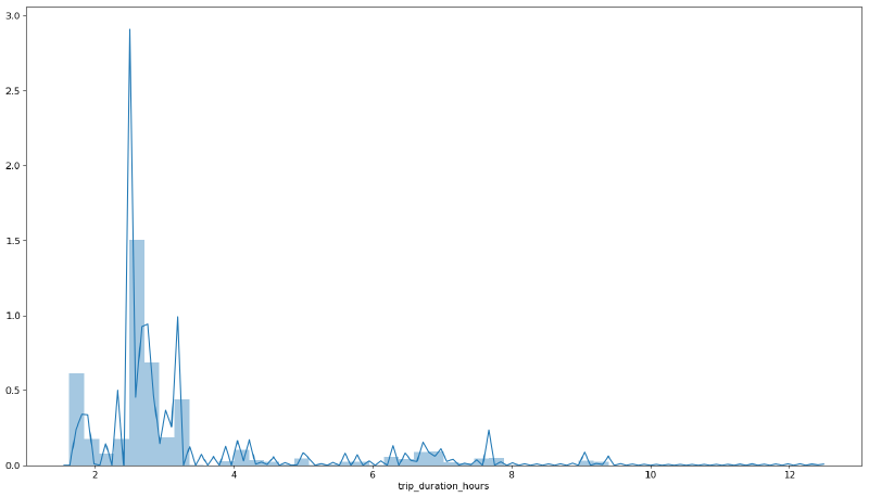
Most trips that are ‘high’ speed should take far less than 4 hours. Otherwise it means that the train is not really high speed or there is a transfer involved. We are not interested in those trips, so, can set a threshold and filter any trip over that value:
high_speed_max_duration = 4
renfe = renfe.loc[renfe['trip_duration_hours'] < high_speed_max_duration, :]
Compute time left to train departure#
We will also need a variable that represents how much time lasts to train departure from the very moment of data scrapping. This impacts heavily on price as it increases as departure is closer in time (intuition says that is important getting tickets with enough time).
renfe.loc[:,'time_to_departure'] = renfe['start_date'] - renfe['insert_date']
renfe.loc[:,'time_to_departure_days'] = renfe['time_to_departure'].dt.components.days \
                                      + renfe['time_to_departure'].dt.components.hours / 24 + \
                                        renfe['time_to_departure'].dt.components.minutes / 60 / 24
Negative values for time_to_departure must be filtered as they are probably due to errors in scrapping or Renfe webpage maintenance.
renfe = renfe.loc[renfe['time_to_departure_days'] > 0, :]Price vs time left to train departure#
And finally, let’s answer the question using some visualizations. First, let’s make a function that plots price vs time to departure given an origin, destination, and a minimum of scrapped points to plot.
It is interesting to make it interactive, as it is expected that price changes are due to fare and train class differences, and tooltips with that information will be useful to have. Because of our publishing platform limitations, plots in this post will be static, but using this code you should be able to reproduce it easily.
def plot_price_vs_time_to_departure(origin,
                                    destination,
                                    min_obs=256,
                                    n_trips=8,
                                    dynamic=False):

    trips_obs = renfe['trip_id'].value_counts()
    min_obs_filter = renfe['trip_id'] \
    .isin(trips_obs[trips_obs > min_obs] \
    .index.to_list())

    filter_origin_destination = (renfe['origin'] == origin) & \
    (renfe['destination'] == destination)

    traces = []

    for trip_id in random.sample(list(renfe[filter_origin_destination \
                                            & min_obs_filter].trip_id.unique()), n_trips):

        trip = renfe[renfe['trip_id'] == trip_id] \
        .drop_duplicates(subset='insert_date',
        keep='first').sort_values('insert_date',
        ascending=False)

#         filter_departure_filter = trip['time_to_departure_days'] >= 0.0
#         trip = trip.loc[filter_departure_filter, :]

        traces.append(go.Scatter(
                      x=trip['time_to_departure_days'],
                      y=trip['price'],
                      name = f"{origin}-{destination}-{trip['start_date'].iloc[0].strftime('%A-%H:%M')}",
                      text = trip['fare'] + \
                             '_' + trip['train_class'] + \
                             '_' + trip['train_type'],
                      hoverinfo = 'text+y+x',
                      opacity = 0.6))

    layout = dict(
        title='price vs time to departure (days)',
        xaxis=dict(title='time to departure (days)',
                   rangeslider=dict(visible = True)),
        yaxis=dict(title='price (€)'),
        legend=dict(font=dict(size=10)),
    )

    fig = dict(data=traces, layout=layout)

    if dynamic:

        iplot(fig, filename = "price_vs_time_to_departure")
    else:
        img_bytes = pio.to_image(fig,
                                 format='png',
                                 width=1200,
                                 height=700,
                                 scale=1)
        Image(img_bytes)

    plot(fig, filename = f"price_vs_time_to_departure_{origin}_{destination}.html", auto_open=False)
    display(Image(img_bytes))
Madrid to Barcelona route#
plot_price_vs_time_to_departure('BARCELONA',
                                'MADRID',
                                min_obs=400,
                                n_trips=8)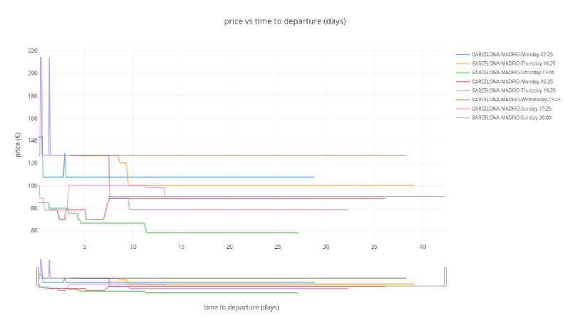
As seen in the plot, there is a variation in price, going up and down depending on different situations. The general trend is that, the closer the departure time is, the higher the price. Price changes because of two reasons:
- Cheaper tickets are sold out: it means that only more expensive tickets are available (for example fare Promo -> Flexible, or train class Turista -> Preferente).
- Due to ticket cancellations or increases in train capacity (longer trains) cheaper tickets are released and price drops.
Gaps in the series means that all tickets are sold our or problems with our scrapping system (more likely the first option).
Madrid to Sevilla route#
plot_price_vs_time_to_departure('MADRID', 'SEVILLA')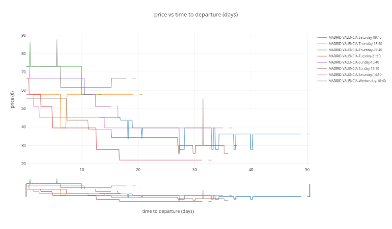
A similar behavior is shown here, maybe with more stable/predictable prices and less price drops.
Madrid to Valencia route#
plot_price_vs_time_to_departure('MADRID', 'VALENCIA')
Same feeling here, stable/predictable prices with only a few price drops.
Madrid to Ponferrada#
plot_price_vs_time_to_departure('MADRID', 'PONFERRADA')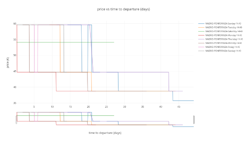
I this case there is no direct High Speed Train to Ponferrada and a transfer is needed in León.
Conclusions#
Up to this point, data looks promising. Copying directly from our project Trello board, our idea is described as:
- Show tickets from Renfe and 2nd hand stores for user selected day and time period.
- Give the user the option to set an alarm and be notified in case ticket (second hand or Renfe) experiment a price drop (only drops, not rises).
- In case there is no options available, set up an alarm when the new ticket is released.